Question 31
- (Exam Topic 4)
Correct Answer:A - (Exam Topic 4)
Correct Answer:D - (Exam Topic 4)
Correct Answer:B - (Exam Topic 4)
Correct Answer:C - (Exam Topic 4)
Correct Answer:C - (Exam Topic 4)
Correct Answer:A
You have a Power BI report.
You need to create a calculated table to return the 100 highest spending customers.
How should you complete the DAX expression? To answer, select the appropriate options in the answer area.
NOTE: Each correct selection is worth one point.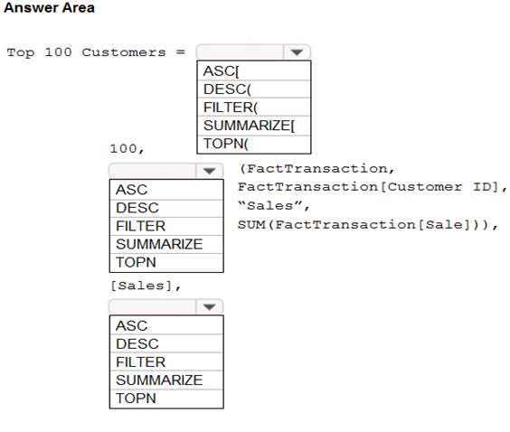
Solution:
Box 1: TOPN
TOPN returns the top N rows of the specified table. Box 2: SUMMARIZE
SUMMARIZE returns a summary table for the requested totals over a set of groups. Box 3: DESC
Sort in descending order.
It is last in the TOPN command. TOPN syntax:
TOPN(,
https://docs.microsoft.com/en-us/dax/topn-function-dax
https://docs.microsoft.com/en-us/dax/summarize-function-dax
Does this meet the goal?
Question 32
You create a report by using Microsoft Power BI Desktop.
The report uses data from a Microsoft SQL Server Analysis Services (SSAS) cube located on your company’s internal network.
You plan to publish the report to the Power BI Service.
What should you implement ta ensure that users who consume the report from the Power BI Service have the most up-to-date data from the cube?
When you’ve created dynamic reports in Power BI Desktop, you can share them by publishing to your Power BI site. When you publish a Power BI Desktop file with a live connection to a tabular model to your Power BI site, an on-premises data gateway must be installed and configured by an administrator.
Question 33
Note: This question is part of a series of questions that present the same scenario. Each question in the series contains a unique solution that might meet the stated goals. Some question sets might have more than one correct solution, while others might not have a correct solution.
After you answer a question in this scenario, you will NOT be able to return to it. As a result, these questions will not appear in the review screen.
You have a clustered bar chart that contains a measure named Salary as the value and a field named Employee as the axis. Salary is present in the data as numerical amount representing US dollars.
You need to create a reference line to show which employees are above the median salary. Solution: You create a constant line and set the value to .5.
Does this meet the goal?
Instead create a percentile line by using the Salary measure and set the percentile to 50%.
Note: The 50th percentile is also known as the median or middle value where 50 percent of observations fall below.
Reference:
https://dash-intel.com/powerbi/statistical_functions_percentile.php
Question 34
You need to create a visualization that compares revenue and cost over time. Which type of visualization should you use?
A line chart or line graph displays the evolution of one or several numeric variables. Data points are connected by straight line segments. A line chart is often used to visualize a trend in data over intervals of time – a time series – thus the line is often drawn chronologically.
Example:
Reference:
https://www.data-to-viz.com/graph/line.html
Question 35
In the Power BI service, you create an app workplace that contains several dashboards.
You need to provide a user named user1@contoso.com with the ability to edit and publish dashboards. What should you do?
Question 36
You build a report to analyze customer transactions from a database that contains the tables shown in the following table.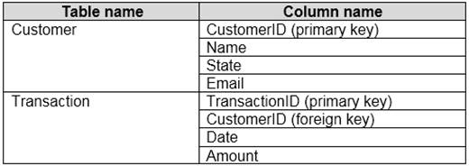
You import the tables.
Which relationship should you use to link the tables?
Each customer can have many transactions.
For each transaction there is exactly one customer.