Question 13
- (Exam Topic 4)
You need to create a visual as shown in the following exhibit.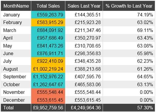
The indicator color for Total Sales will be based on % Growth to Last Year. The solution must use the existing calculations only.
How should you configure the visual? To answer, select the appropriate options in the answer area.
NOTE: Each correct selection is worth one point.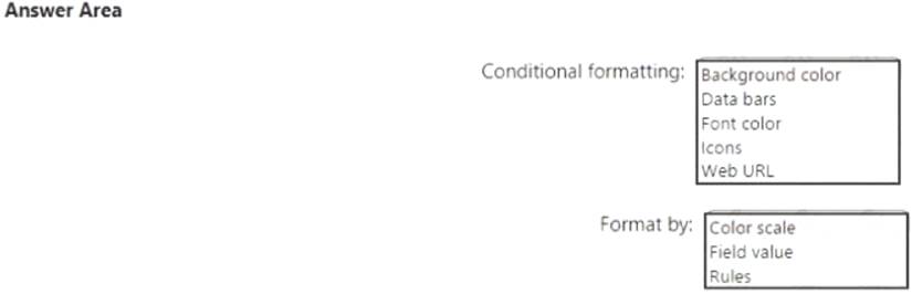
Solution:
Box 1: Background color
To format the Color column based on its field values, select Conditional formatting for the Color field, and then select Background color or Font color.
In the Background color or Font color dialog box, select Field value from the Format by drop-down field. Box 2: Field value
With conditional formatting for tables in Power BI Desktop, you can specify customized cell colors, including color gradients, based on field values.
Reference:
https://docs.microsoft.com/en-us/power-bi/create-reports/desktop-conditional-table-formatting
Does this meet the goal?
Correct Answer:A
Question 14
- (Exam Topic 4)
You have a collection of reports for the HR department of your company.
You need to create a visualization for the HR department that shows a historic employee counts and predicts trends during the next six months.
Which type of visualization should you use?
Correct Answer:C
The best data for forecasting is time series data or uniformly increasing whole numbers. The line chart has to have only one line.
Try forecasting: Try the new forecasting capabilities of Power View today on your own data or with the sample report available as part of the Power BI report samples. To view your own data, upload a workbook with a Power View time series line chart to Power BI for Office 365.
Reference:
https://powerbi.microsoft.com/en-us/blog/introducing-new-forecasting-capabilities-in-power-view-for-office-36
Question 15
- (Exam Topic 4)
You have a Power BI tenant.
You have reports that use financial datasets and are exported as PDF files. You need to ensure that the reports are encrypted.
What should you implement?
Correct Answer:C
General availability of sensitivity labels in Power BI.
Microsoft Information Protection sensitivity labels provide a simple way for your users to classify critical content in Power BI without compromising productivity or the ability to collaborate. Sensitivity labels can be applied on datasets, reports, dashboards, and dataflows. When data is exported from Power BI to Excel, PowerPoint or PDF files, Power BI automatically applies a sensitivity label on the exported file and protects it according to the label’s file encryption settings. This way your sensitive data remains protected no matter where it is.
Reference:
https://powerbi.microsoft.com/en-us/blog/announcing-power-bi-data-protection-ga-and-introducing-new-capabil
Question 16
- (Exam Topic 4)
You build a report to help the sales team understand its performance and the drivers of sales. The team needs to have a single visualization to identify which factors affect success. Which type of visualization should you use?
Correct Answer:A
The key influencers visual helps you understand the factors that drive a metric you're interested in. It analyzes your data, ranks the factors that matter, and displays them as key influencers.
The key influencers visual is a great choice if you want to:  See which factors affect the metric being analyzed.
 Contrast the relative importance of these factors. For example, do short-term contracts have more impact on churn than long-term contracts?
Reference:
https://docs.microsoft.com/en-us/power-bi/visuals/power-bi-visualization-influencers
Question 17
- (Exam Topic 4)
You have a Power BI report. The report contains visualizations that have interactions. You need to identify which visualizations take the longest to complete. What should you use?
Correct Answer:B
Use Power BI Desktop Performance Analyzer to optimize reports.
In Power BI Desktop you can find out how each of your report elements, such as visuals and DAX formulas, are performing. Using the Performance Analyzer, you can see and record logs that measure how each of your report elements performs when users interact with them, and which aspects of their performance are most (or least) resource intensive. Reference:
https://docs.microsoft.com/en-us/power-bi/create-reports/desktop-performance-analyzer
Question 18
- (Exam Topic 4)
You plan to use Power BI Desktop optimized for Power BI Report Server to create a report. The report will be published to Power BI Report Server.
You need to ensure that all the visualization in the report can be consumed by users.
Which two types of visualizations should you exclude from the report? Each correct answer presents part of the solution.
NOTE: Each correct selection is worth one point.
Correct Answer:DE
References: https://powerbi.microsoft.com/en-us/guided-learning/reportserver-quickstart-powerbi-report/