Question 19
A data analyst needs to present the results of an online marketing campaign to the marketing manager. The manager wants to see the most important KPIs and measure the return on marketing investment. Which of the following should the data analyst use to BEST communicate this information to the manager?
Correct Answer:D
The option that the data analyst should use to best communicate the information to the manager is a summary with statistics, conclusions, and recommendations from the data analyst. A summary is a concise and clear way of presenting the main findings and insights from the data analysis report. A summary should include relevant statistics that support the conclusions and recommendations from the data analyst. A summary should also highlight the most important KPIs and measure the return on marketing investment in relation to the objectives of the online marketing campaign. The other options are not as effective as using a summary to communicate the information to the manager, as they either provide too much or too little information or do not address the manager??s needs or expectations. A real-time monitor may provide too much information that can be overwhelming or distracting for the manager who wants to see only the most important KPIs and measure the return on marketing investment. A self-service dashboard may provide too little information that can be insufficient or unclear for the manager who wants to see some guidance and interpretation from the data analyst. A spreadsheet of raw data may provide irrelevant or inaccurate information that can be confusing or misleading for the manager who wants to see some analysis and insights from the data analyst. Reference: [How to Write an Executive Summary for Your Data Analysis Report - Towards Data Science]
Question 20
A data scientist wants to see which products make the most money and which products attract the most customer purchasing interest in their company.
Which of the following data manipulation techniques would he use to obtain this information?
Correct Answer:B
The correct answer is B: Data blending.
Data blending is combining multiple data sources to create a single, new dataset, which can be presented visually in a dashboard or other visualization and can then be processed or analyzed. Enterprises get their data from a variety of sources, and users may want to temporarily bring together different datasets to compare data relationships or answer a specific question. Data append is incorrect. Data append is a process that involves adding new data elements to an existing database. An example of a common data append would be the enhancement of a company's customer files. A data append takes the information they have, matches it against a larger database of business data, allowing the desired missing data fields to be added. Normalize data is incorrect.
Data normalization is the process of structuring your relational customer database, following a series of normal forms. This improves the accuracy and integrity of your data while ensuring that your database is easier to navigate. Data merge is incorrect. Data merging is the process of combining two or more data sets into a single data set.
Question 21
An analyst needs to provide a chart to identify the composition between the categories of the survey response data set: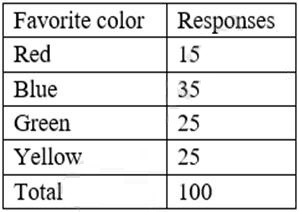
Which of the following charts would be BEST to use?
Correct Answer:B
The best chart to use to identify the composition between the categories of the survey response data set is a pie chart. A pie chart is a circular chart that shows the relative proportions of different categories in a whole. A pie chart is divided into slices that represent the percentage or frequency of each category. A pie chart is suitable for displaying categorical data that has a few categories and does not have any hierarchical or temporal relationship. In this case, a pie chart can show the composition of the favorite colors among the survey respondents, as well as the percentage of each color. The other options are not as good as a pie chart for this purpose, as they are more suitable for displaying numerical data that has some kind of distribution, trend, correlation, or comparison. A histogram is a bar chart that shows the frequency distribution of a single numerical variable. A line chart is a chart that shows the change of one or more numerical variables over time or another continuous variable. A scatter plot is a chart that shows the relationship between two numerical variables by plotting them as points on a Cartesian plane. A waterfall chart is a chart that shows how an initial value is increased or decreased by a series of intermediate values, resulting in a final value. Reference: [Choosing the Right Chart Type - DataCamp]
Question 22
Which of the following describes the method of sampling in which elements of data are
selected randomly from each of the small subgroups within a population?
Correct Answer:D
This is because stratified is a type of sampling in which elements of data are selected randomly from each of the small subgroups within a population, such as age groups, gender groups, or income groups. Stratified sampling can be used to ensure that the sample is representative and proportional of the population, as well as reduce the sampling error or bias. For example, stratified sampling can be used to select a sample of voters from different political parties based on their proportion in the population. The other types of sampling are not the types of sampling in which elements of data are selected randomly from each of the small subgroups within a population. Here is why:
✑ Simple random is a type of sampling in which elements of data are selected randomly from the entire population, without dividing it into any subgroups. Simple random sampling can be used to ensure that every element in the population has an equal chance of being selected, as well as avoid any systematic error or bias. For example, simple random sampling can be used to select a sample of students from a school by using a lottery or a computer-generated number.
✑ Cluster is a type of sampling in which elements of data are selected randomly from
a few large subgroups within a population, such as regions, districts, or schools. Cluster sampling can be used to reduce the cost and complexity of sampling, as well as increase the feasibility and convenience of sampling. For example, cluster sampling can be used to select a sample of households from a few neighborhoods by using a map or a list.
✑ Systematic is a type of sampling in which elements of data are selected at regular
intervals from an ordered list or sequence within a population, such as every nth element or every kth element. Systematic sampling can be used to simplify and speed up the sampling process, as well as ensure that the sample covers the entire range or scope of the population. For example, systematic sampling can be used to select a sample of books from a library by using an alphabetical order or a numerical order.
Question 23
An analyst must obtain the average daily sales for the following week: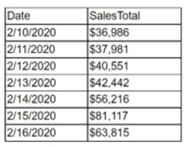
Which of the following must the analyst perform to obtain this value?
Correct Answer:C
Data aggregation is the process of compiling data from multiple sources and summarizing it into a single dataset. Data aggregation can be used to calculate statistics, such as averages, sums, counts, or percentages. In this case, the analyst must obtain the average daily sales for the following week, which is a statistic that can be calculated by aggregating the sales data from each day and dividing by the number of days. Data aggregation can be done using various tools and methods, such as spreadsheets, databases, or programming languages.
Question 24
Which one of the following would not normally be considered a summary statistic?
Correct Answer:A
Simply put, a z-score (also called a standard score) gives you an idea of how far from the mean a data point is. But more technically it's a measure of how many standard deviations below or above the population mean a raw score is. A z-score can be placed on a normal distribution curve.