Question 73
A data analyst received the information in the table below from a recently completed marketing campaign: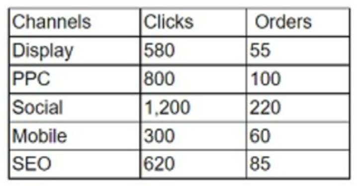
Which of the following is the total order conversion rate?
Correct Answer:B
The correct answer is A. 13.2%.
The total order conversion rate is the ratio of the total number of orders to the total number of clicks, expressed as a percentage. To calculate the total order conversion rate, we need to sum up the clicks and orders from all the channels, and then divide the orders by the clicks and multiply by 100.
Using the data from the table, we can do the following:
✑ Total clicks = 580 + 800 + 1,200 + 300 + 620 = 3,500
✑ Total orders = 55 + 100 + 220 + 60 + 85 = 520
✑ Total order conversion rate = (520 / 3,500) x 100 = 14.857%
✑ Rounding to one decimal place, we get 14.9% Therefore, the total order conversion rate is 14.9%.
Question 74
Given the image below: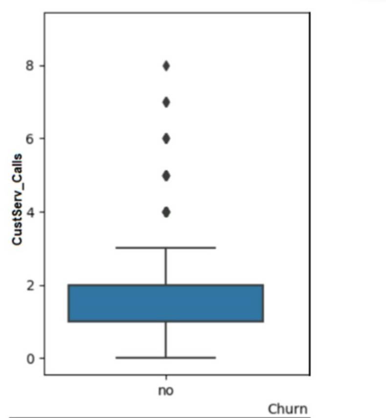
The data should be cleaned because of the presence of:
Correct Answer:A
The answer is A. Outlier.
Short Explanation: An outlier is a data point that differs significantly from the rest of the data in a dataset. An outlier can indicate an error, an anomaly, or a rare event in the data. An outlier can affect the statistical analysis and visualization of the data, such as skewing the mean, variance, or distribution of the data. Therefore, data should be cleaned to identify and remove or correct any outliers.
The image below shows a box plot graph with a vertical axis labeled ??Customer Calls?? and a horizontal axis labeled ??Churn??. The box plot is blue in color and the median value is around 2. There are 7 outliers above the box plot, ranging from 4 to 8. image)
A box plot is a type of graph that can show the distribution of data values using five summary statistics: minimum, maximum, median, first quartile, and third quartile. The box represents the interquartile range (IQR), which is the difference between the first and third quartiles. The median is shown as a line inside the box. The whiskers extend from the box to the minimum and maximum values, excluding any outliers. Outliers are shown as dots or circles outside the whiskers.
In this graph, we can see that most of the customer calls are between 0 and 4, with a median of 2. However, there are 7 outliers that have more than 4 customer calls, up to 8. These outliers may indicate some customers who have more issues or complaints than others, or some errors or anomalies in the data collection or recording process. These outliers can affect the analysis and interpretation of the customer calls and churn relationship, such as making it seem that more customer calls lead to less churn, which may not be true for the majority of the customers. Therefore, data should be cleaned to investigate and handle these outliers appropriately.
Question 75
A data analyst has been asked to organize the table below in the following ways: By sales from high to low -
By state in alphabetic order -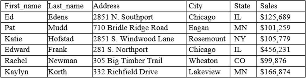
Which of the following functions will allow the data analyst to organize the table in this manner?
Correct Answer:D
Sorting is the function that will allow the data analyst to organize the table in the desired manner. Sorting means arranging the data in a specific order, such as ascending or descending, based on one or more criteria. Sorting can be applied to any column in the table, such as sales or state. References: CompTIA Data+ Certification Exam Objectives, page 11
Question 76
Which one of the following is a common data warehouse schema?
Correct Answer:A
Snowflake enables data storage, processing, and analytic solutions that are faster, easier to use, and far more flexible than traditional offerings. The Snowflake data platform is not built on any existing database technology or ??big data?? software platforms such as Hadoop.