Question 61
A data analyst is designing a dashboard that will provide a story of sales and determine which site is providing the highest sales volume per customer. The analyst must choose an appropriate chart to include in the dashboard. The following data is available: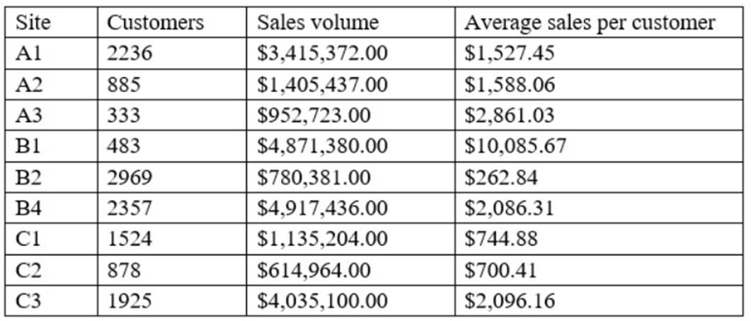
Which of the following types of charts should be considered?
Correct Answer:C
A scatter chart using sales volume and average sales per customer is the best type of chart to include in the dashboard. A scatter chart is a type of chart that displays the relationship between two numerical variables using dots or markers. A scatter chart can show how one variable affects another, how strong the correlation is between them, and how the data points are distributed. In this case, a scatter chart can show the story of sales and determine which site is providing the highest sales volume per customer by plotting the sales volume on the x-axis and the average sales per customer on the y-axis. Each dot on the chart will represent a site, and the analyst can easily compare the sites based on their position on the chart. A site with a high sales volume and a high average sales per customer will be in the upper right quadrant, indicating a high performance. A site with a low sales volume and a low average sales per customer will be in the lower left quadrant, indicating a low performance. A site with a high sales volume and a low average sales per customer will be in the lower right quadrant, indicating a high volume but low value. A site with a low sales volume and a high average sales per customer will be in the upper left quadrant, indicating a low volume but high value. A scatter chart can also show if there is a positive or negative correlation between the two variables, or if there is no correlation at all. A positive correlation means that as one variable increases, so does the other. A negative correlation means that as one variable increases, the other decreases. No correlation means that there is no relationship between the two variables.
The other types of charts are not as suitable for this purpose. A line chart is a type of chart that displays the change of one or more variables over time using lines. A line chart can show trends, patterns, and fluctuations in the data. However, in this case, there is no time variable involved, so a line chart would not be appropriate. A pie chart is a type of chart that displays the proportion of each category in a whole using slices of a circle. A pie chart can show how each category contributes to the total and compare the relative sizes of each category. However, in this case, there are two numerical variables involved, so a pie chart would not be able to show their relationship. A column chart is a type of chart that displays the comparison of one or more variables across categories using vertical bars. A column chart can show how each category differs from each other and rank them by size. However, in this case, a column chart would not be able to show the relationship between sales volume and average sales per customer, as it would only show one variable for each site.
Question 62
What R package makes it easy to work with dates?
Correct Answer:A
Lubridate is an R package that makes it easier to work with dates and times.
Question 63
A user receives a large custom report to track company sales across various date ranges. The user then completes a series of manual calculations for each date range. Which of the following should an analyst suggest so the user has a dynamic, seamless experience?
Correct Answer:D
Create a dashboard with a date range picker and calculations built in. This is because a dashboard is a type of visualization that displays multiple charts or graphs on a single page, usually to provide an overview or summary of some data or information. A dashboard can be used to track company sales across various date ranges by showing different metrics and indicators related to sales, such as revenue, volume, or growth. By creating a dashboard with a date range picker and calculations built in, the analyst can suggest a way for the user to have a dynamic, seamless experience, which means that the user can interact with and customize the dashboard according to their needs or preferences, as well as avoid any manual work or errors. For example, a date range picker is a type of feature or function that allows users to select or adjust the time period for which they want to see the data on the dashboard, such as daily, weekly, monthly, or quarterly. A date range picker can make the dashboard dynamic, as it can automatically update or refresh the dashboard with new data based on the selected time period. Calculations are mathematical operations or expressions that can be performed on the data on the dashboard, such as addition, subtraction, multiplication, division, average, sum, etc. Calculations can make the dashboard seamless, as they can eliminate the need for manual calculations for each date range, as well as ensure accuracy and consistency of the results. The other ways are not the best ways to provide a dynamic, seamless experience for the user. Here is why:
✑ Creating multiple reports, one for each needed date range would not provide a dynamic, seamless experience for the user, but rather create a static, cumbersome experience, which means that the user cannot interact with or customize the reports according to their needs or preferences, as well as have to deal with multiple files or pages. For example, creating multiple reports would make it difficult for the user to compare or contrast the sales across different date ranges, as well as increase the workload and complexity of managing and maintaining the reports.
✑ Building calculations into the report so they are done automatically would not
provide a dynamic, seamless experience for the user, but rather provide a partial, limited experience, which means that the user can only benefit from one aspect or feature of the report, but not from others. For example, building calculations into the report would help with avoiding manual work or errors, but it would not help with interacting with or customizing the report according to different date ranges.
✑ Adding macros to the report to speed up the filtering and calculations process
would not provide a dynamic, seamless experience for the user, but rather provide an advanced, complex experience, which means that the user would need to have some technical skills or knowledge to use or apply the macros, as well as face some potential risks or challenges. For example, adding macros to the report would require the user to know how to write or run the macros, which are a type of code or script that automates certain tasks or actions on the report, such as filtering or calculating the data. Adding macros to the report could also expose the user to some security or compatibility issues, such as viruses, malware, or errors.
Question 64
A financial institution is reporting on sales performance to a company at the account level. Due to the sensitive nature of the government the does il with, some account information is not shown. Which of the following fields should be masked?
Correct Answer:D
Customer name is the field that should be masked, because it contains sensitive information that could identify the government accounts that the financial institution deals with. Masking is a technique that replaces or obscures sensitive data with dummy or random data, such as asterisks or hashes. Masking can help protect the privacy and security of the data, while still allowing for some analysis and reporting. Therefore, the correct answer is D. References: [Data Masking | Definition, Techniques & Examples - Talend], [Data masking - Wikipedia]
Question 65
An analyst develops an IT document and needs to describe the technical terms used in the document. Which of the following is where the analyst should include descriptions of the technical terms?
Correct Answer:A
In technical documentation, a glossary is the designated section where definitions for technical terms are provided. It serves as a reference point for readers to understand specialized or uncommon words used within the document. Including descriptions of technical terms in a glossary ensures that readers have a consistent resource to refer to, which can improve comprehension and reduce misunderstandings12.
A system diagram (Option B) is a visual representation of the system??s components and their interactions, not a place for defining terms. User requirements (Option C) outline what end-users expect from the system, and an index (Option D) is an alphabetical list of topics covered in the document, usually with page numbers, but not definitions.
References:
✑ Creating effective technical documentation1.
✑ Best practices when writing technical descriptions3.
Question 66
An analyst wants to check the progress and performance regarding the number of customers an organization served in the last six years. Which of the following represents the type of analysis the analyst should perform?
Correct Answer:B